


How to swipe more TikTok wins using carousels
Plus Jimmy John's is sorry not sorry and Entertainment Tonight taps into the Love Is Blind reunion drama.

TikTok carousels are not new. But they are also not going anywhere. For a platform that originally began as video-only, the shift to also include photos and carousels has been swift and unrelenting. In the race to become the one-stop social destination, TikTok has gone through various phases of pushing photos, and now they’re taking things one step further by sharing some ‘insider tips’ and ‘best practices’ to create engaging photo posts. Let’s talk about a few of them:
Don’t overlook the title: “Create a compelling title that will instantly hook in users and convince them to stop scrolling and swipe through your photo post.”
Reel users in with an interesting one-liner that teases something slash anything. Appearing in bolded text on top of the standard caption, it’s almost definitely more valuable than the copy that follows. I like to approach it the same way I would a YouTube title.

Tell a complete story: “Don't think of photo posting as a photo dump—every post should have the same narrative arc as a video would (i.e. a clear beginning, middle, and end).”
While your instinct might be to transfer all your Instagram carousels over to TikTok for easy wins, you're better off filtering out anything that doesn't follow a coherent sequence.

Each slide should be leading somewhere: “Use text on screen and audio to help build on your story in each frame.”
To increase watch time, retention, and engagement, do your followers a solid and ensure there’s a payoff at the end. If they’re investing valuable swiping time into your content, the least you can do is make it gratifying for them.

Write with TikTok SEO in mind: “Write descriptive captions that will ensure your content populates in our search engines.”
If TikTok is the new Google for many people, be mindful of how people search for things and mimic those patterns in the description.
Speaking of the description: No need to be short and sweet there. “Pair your photo content with longer descriptions. You can have up to 4,000 characters for each post!”
TikTok is actively encouraging longer captions to expand on the content with additional details, storytelling, tips, and general background info.

ICYMI
Users can now upload three-minute long videos on Bluesky.
YouTube will begin to manually review more videos for ad suitability: “To improve the accuracy of our yellow icon decisions and get your videos monetizing faster, we are experimenting with automatically sending videos that receive a “Limited or no ads” rating for an additional review.”
Facebook is introducing stories monetization for creators who are part of the Facebook Content Monetization program.
Meta will test its community notes feature across Facebook, Instagram, and Threads in the U.S.
LIKE/RETWEET/SHARE/ETC

Told you all I had watched recently was Love Is Blind. As boring/bad as the last season was, the reunion led to some excellent social opportunities – thank you, Dave’s sister, Madison’s screenshots, and Joey as a whole. Let’s talk about how Entertainment Tonight put their own stamp on it.
The split screen intro is super engaging. It taps into the ‘he said/she said’ theme that is every reality TV show reunion, and it’s a great way to let users know they’re going to get both sides of the story.
Speaking of both sides of the story. ET did people a solid by combining the couples into one video. Viewers are able to watch the full story in one clip without having to go back into the grid and search for the corresponding response. 10/10 user experience.
It conveys all the emotions that are clearly still raw for these couples. Seeing the reactions right off the bat feels so personal, and it’s not your average interview content.
This doubles the engagement. Instead of people commenting on just Ben’s explanation or just Sarah’s, people get to comment on everything all at once. As proven by the 970 comments this video racked up.
Make it work for you: ET was far from the only outlet publishing LIB content following the reunion.. But they managed to break through the noise by doing something different and standing out. They took the standard interview format and elevated it.

Just when I thought I was a Jersey Mike’s girlie, Jimmy John’s pulled me back in. That Club Lulu cannot be beat. And neither can their latest post promoting their broadcast channel. Let’s break it down:
Tired? Reminding people in your Story they can subscribe to your Broadcast Channel. Wired? Creating a fake apology graphic that drives people there.
This created intrigue for an area they’re clearly trying to grow. And even if some people saw the post and didn’t join, it created an awareness that the Broadcast Channel exists and they might be more likely to join down the road.
It also drives followers to join in a way that does not feel thirsty. It’s fun, it’s lighthearted, and it’s clever. And it tells people, if this post made you smile, just wait until you see what we’re cooking up in the BC.
Hugs and pickles. That is all.
Make it work for you: Jimmy John’s pulled people in with the fake apology. That format is nothing new, but there’s something to be said for these tried and true social templates.
Post of the week
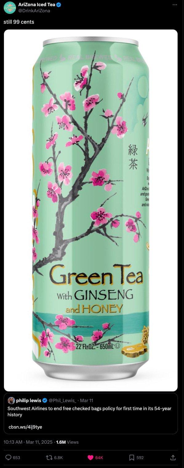
AriZona Iced Tea: still 99 cents and still the best.
Make It Go Viral 🫠 is a social media newsletter from Pennant Digital Director of Social Media Anna Fogel that hits your inbox three times a week. The Monday edition includes news, industry updates, and a breakdown of accounts doing social right. The Wednesday send features interviews with the best and brightest minds working in social media. And we close each week with a curated list of interesting social media job openings.
Share this newsletter with someone who loves social media, won't you?